Overview
Impulso Network enables start-ups, businesses, and organizations to hire talented IT Professionals from a growing network.
Impulso's primary method of recruiting was a website and Slack channel with Pipefy and forms integrations. The problem was that the non-stop growing community was hard to manage by recruiters and the candidates took some time to fill in applications, resumes, questionnaires.
My role
- Information Architecture, Interaction, Visual Design
- Design & Research Tool Kit
- Desk Research: google, spreadsheets, pencil, and paper
- Stakeholders Interview: paper, spreadsheets, zoom
- Figma/Figma Prototype: hours in it, to design a new onboarding process
Approach
Research
The first step was to understand user pain points with the service before redesigning the app. For that, I interviewed some community members and also recruiters, with questions that led to the right insights that helped to define the main features that would be focused.
Insights
After hours of talks with stakeholders (recruiters and community members), I could gather some insights and understand their specifics needs:
- New members had to fill out forms… again!
- Decentralized profile update
- Too many unqualified applicants
- Complex candidate pipeline
Solution
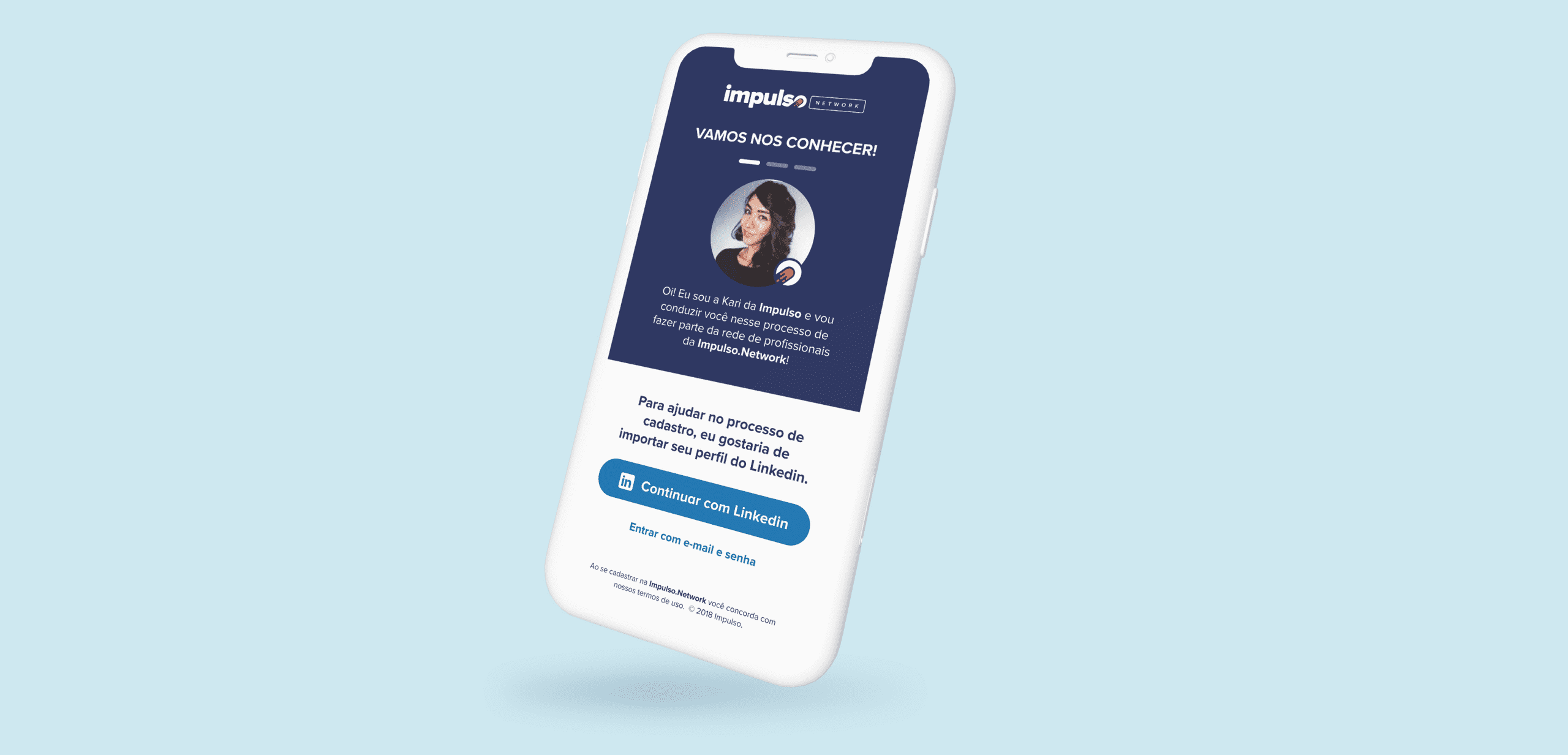
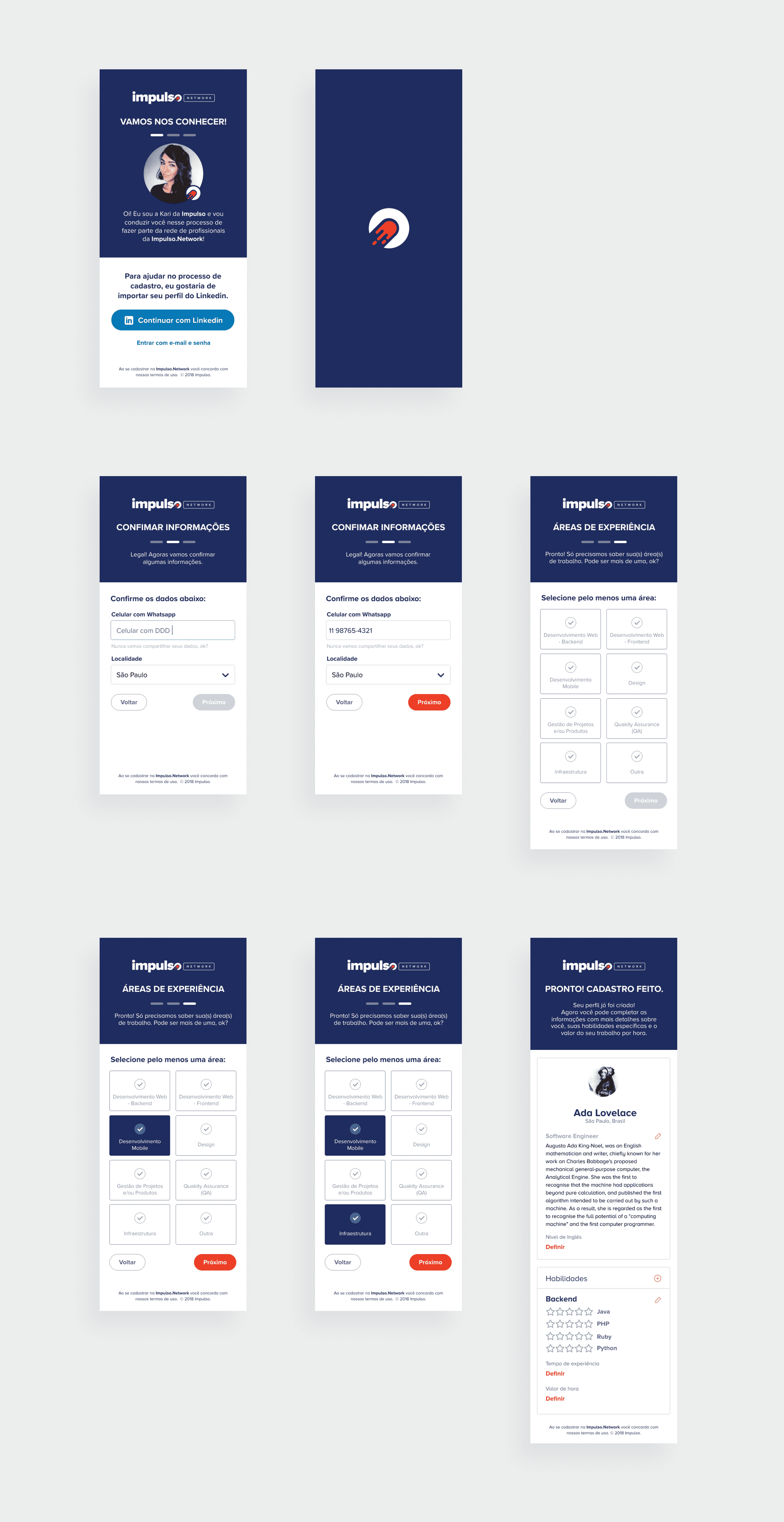
After our discoveries, we decided to redesign the onboarding process using LinkedIn as the primary login option, so that Impulso could pull all the necessary information quickly. Candidates could also make quick updates to their profiles, and recruiters would have standardized consultation data.
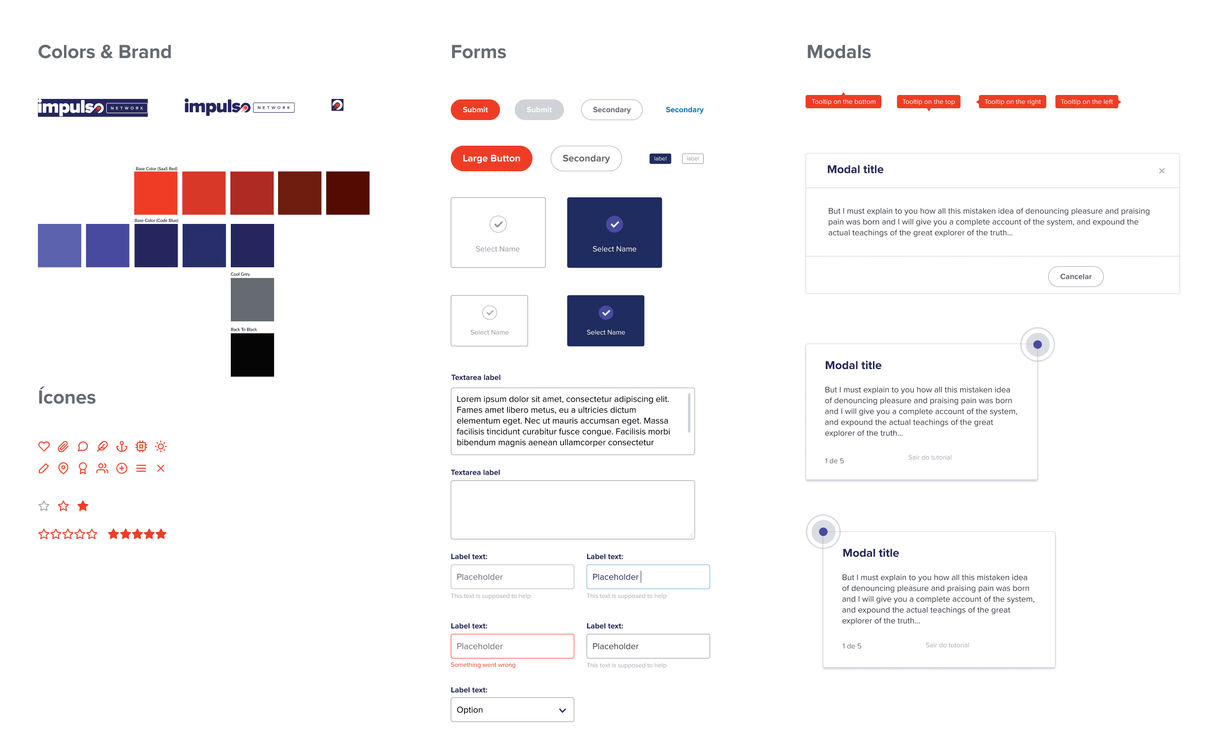
Styleguide

Interface

